How Colour Psychology Affects Your Mood at Home
February 27, 2016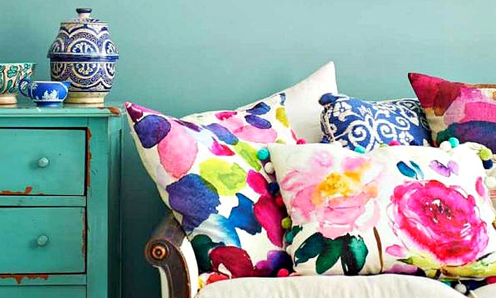 Have you ever walked into a hotel room and felt unusually calm; or entered your friend’s house and felt suddenly energized on a drowsy day? Some of it may be because of background music or the decor of the room. However, the most significant thing in a room that affects mood is colour.
Colour by itself, conveys a lot of emotions and meaning in a subtle way. It’s important to understand what these emotions are before selecting paint colours. With a little knowledge about how colour psychology affects your mood, you’ll be able function well and enjoy the feeling you desire in every room.
11 Ways Colour Psychology Affects Your Mood
RED Energy, passion, strength. Good for kitchen and dining room. Helps to increase appetite and encourage conversation. However, it should be avoided in rooms where you relax.
PINK Playful, soft, romantic. Typical for bedroom and bathroom. Pink is also associated with nostalgia and can be used in the kitchen, too.
ORANGE Jovial, sunset, sociable. Good for a family and living rooms because it stimulates conversation.
TANS and BROWNS Rugged, rustic, grounded. Versatile colour. Tans are so neutral they could be used in any room. Browns work well in living rooms, bedrooms, and bathrooms.
BLUE Calm, cool, open, productivity. Mainly for bedrooms, bathrooms and any place you want to relax and unwind. Blue is great for workout rooms because it doesn’t make you feel hot. Use it in your home office to feel more productive.
GREEN Life, restful, nature. Ideal for living rooms or bedroom. It provides a welcoming and mature tone. This colour is also great for a home office.
YELLOW Illuminating, sunshine, soft, speeds up metabolism. Suitable for kitchen, sun room, children’s room, and porch. However, studies show that a baby will tend to cry more in a yellow bedroom.
PURPLE Sensual, dramatic, royal. Lighter shades such as lavender are neat for bedrooms, and living rooms.
BLACK Heavy, bold, menacing. Can be used to set contrasts and highlights. Use some black in your furnishings to ground a room.
WHITE Purity, simplicity, cleanliness. Used best in a room filled with varied colours and/or textures.
GREY Responsible, conservative, professional. Can be used in living room, bathrooms, or dining room. This colour gives a modern yet retro look.
The next time you are ready to pick up a paint brush to give one of your rooms a new look, remember how colour psychology affects mood. Generally speaking, your warm colours like yellow, orange, and red are stimulating colours; cool colours such as greens, blues, and purples are more calming. Have you recently painted a room in your home a totally different colour?
Red Barrinuevo | Your Toronto Home Stager
is a Canadian Certified Staging Professional. His professional affiliations include the Real Estate Staging Association (RESA) and the CSP. He is the recipient of numerous home staging awards and was picked as RESA’s Top Professional Stager of Canada for 2016. He has worked with hundreds of Real Estate Brokers, Investors, Real Estate Agents, and has helped home owners showcase their homes at its best when it is time to sell.
As President and Principal Stager of REDESIGN4MORE, Red provides home staging and interior redecorating services for both small and large-scale residential projects throughout Toronto and the GTA. Click here to learn more about Red and REDESIGN4MORE.
Comments are closed here.