It’s All In The Mix: How to Mingle Many Patterns In One Space
July 6, 2018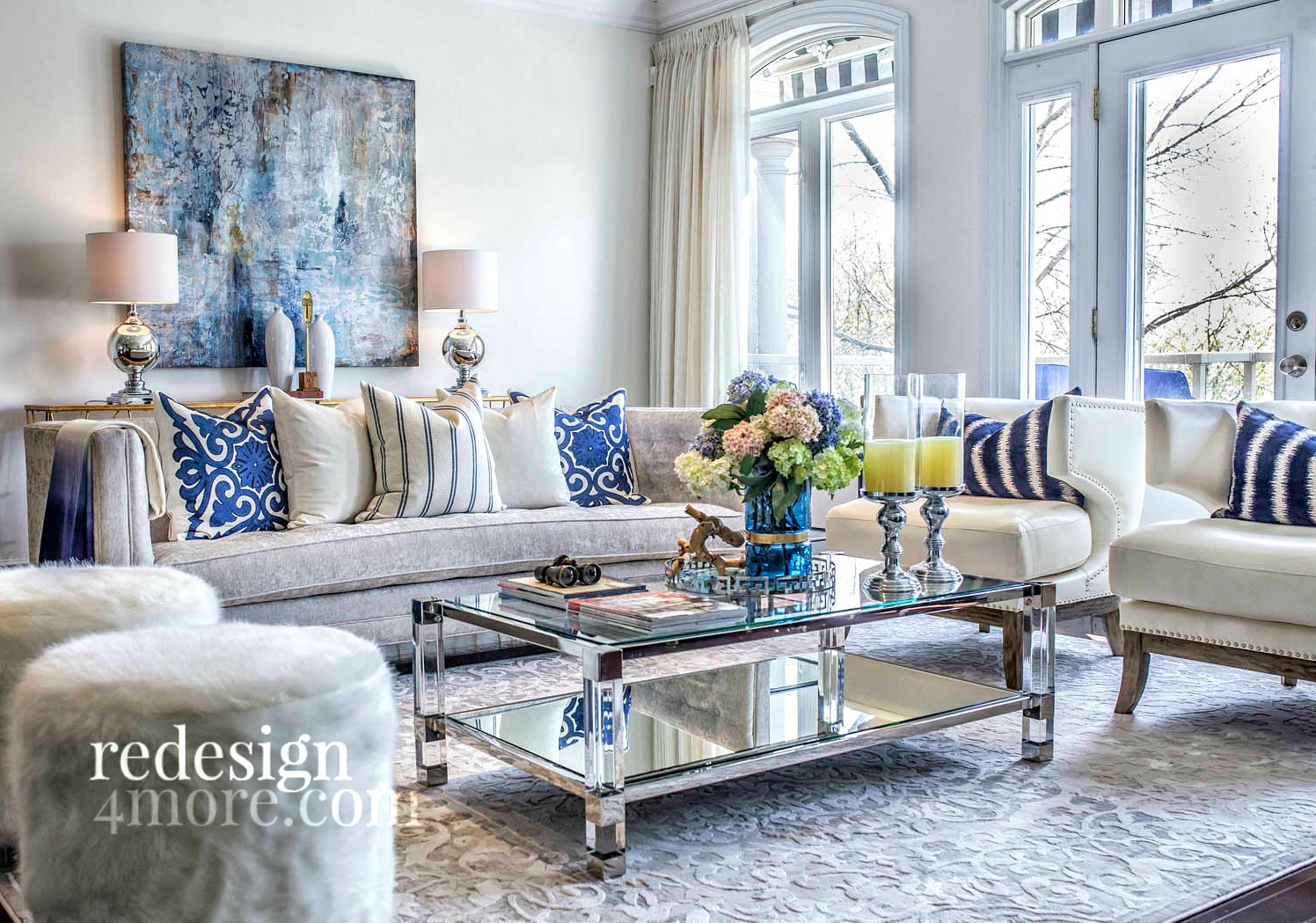
Whoever said less is more hasn’t seen the stunning prints and patterns on the market today. And try your best, you can’t pick just one — nor should you have to. One of my favourite interior styling trends right now is mixing and matching different patterns within a space. I use pattern to set the mood and tell the residents’ story — whatever that may be. It’s also a great way to instantly modernize a home with the motif du jour.
But in spite of all these plusses, pattern is often misconstrued as too complicated, too overwhelming and downright scary. I say, more is definitely more — when it’s done right. Here are a few professional tips from a pro, to help simplify the pattern picking process for a home that is warm, inviting and interesting.
You may have heard of the power of odd numbers in interior decorating. This rule also applies to your patterned paradise! If you’re working with a small space or are just getting your feet wet with this trend, start with three and go from there.
Some of the most successful pattern groupings involve mixing different scales to help create interest. Too many similarly sized prints will confuse the eye. The more subtle designs will naturally act as the neutrals in the room and are often incorporated in larger doses. Meanwhile, the larger bolder patterns will naturally stand out as the focal points.
TIP: Use the 60-30-10 rule to mix patterns in the right doses. The primary pattern gets 60 percent of the coverage, the secondary pattern gets 30 and the accent pattern gets 10 percent. This results in a well-balanced and pleasing composition.
Now for the patterns themselves. Choose what you love, is rule number one. With that said, there is one suggestion I’ll offer in this regard. Choose patterns that strongly contrast one another. For example, a floral, a geometric and an organic print within one living room.
Colour is another important consideration in your palette of pattern. Ensure all your prints have common hues, both in terms of colour and vibrancy. Your patterns will complement each other and work together, as opposed to some being washed out.
By now you know that I’m a purveyor of pattern. But it is possible to have too much of a good thing. Incorporating white into your design gives the eye a place to rest and makes those amazing prints and patterns “pop!”
Last but not least, be sure to balance your patterns with some solid colours as well.
Patterns are a fun and easy way to bring life to your interiors. It can be something as simple as a new chair, a rug and some pillows, to completely change the look of your space. Forget your fears and give pattern a try. You’ll never look back.
RED BARRINUEVO
Toronto-based, award-winning Interior Stylist, Red Barrinuevo is an Interior Decorator and Principal of Redesign4more, servicing clients in Toronto and the GTA. The firm’s known for enhancing and creating stylish yet functional spaces through their creative home staging, interior styling services, and design services. www.redesign4more.com.
Comments are closed here.