How to Tell a Colour Story in Your Home
October 1, 2020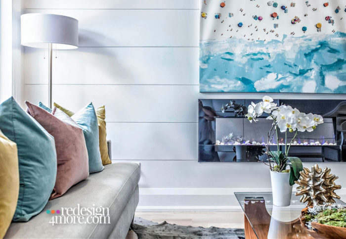
Colour is a largely underutilised and underestimated design tool, although it’s certainly well-leveraged in my own arsenal. As an interior stylist, my job often entails completely changing the look and feel of a space, and colour is my go-to for creating a particular mood and telling a story – whatever that may be. Colour is easy to work with, once you know how.
So, what do you want your home to say about you, and how do you do that? Here are some of my top tips for effectively applying colour in your decorating scheme.
The first step in telling your colour story is determining your colour temperature. From my professional experience, people naturally tend toward either the warm or the cool side of the colour family. It’s almost like it’s built into your DNA. That’s why this is the first question I ask when kicking off a new design project. Without getting too into the weeds, identify if your preferences lean to cooler, aqua-inspired blues, greens and purples, or fiery reds, oranges and yellows. This will form the basis of your colour scheme, and you can build from there.
There’s a little trick used in the design industry that can help answer the question of how much colour is too much. As a general guideline, the 60/30/10 formula provides the ideal proportionate distribution of dominant, secondary and accent colour within your space. By this directive, the dominant colour should occupy about 60 per cent of the picture, and is typically applied to large-scale elements such as walls, rugs and the sofa.
Now that you have your base colour in place, you can start layering in a secondary hue. This colour should be within the same colour family and temperature, in order to complement the base, and it will account for about 30 per cent of the visual area in the room. Think an accent wall, window coverings, armchairs and painted furniture.
Last but certainly not least is the accent colour, for the remaining 10 percent of your space. Your selection should be high-impact. Consider this the climax of your story; the highlight of the room. Choose a hue that attracts attention, something contrasting that really “pops.” If you’re not sure, look to the trusty colour wheel. Find your dominant/secondary hues and then reference the colours opposite on the wheel. That’s your accent. For example, a blue room with yellow accents will deliver that much-needed element of surprise. Incorporate this selection into accessories such as throw pillows and artwork.
My best piece of advice when working with colour is to tackle it with confidence. It’s true that colour can be intimidating at first glance, but it doesn’t have to be. Remember: your home is your castle, and it’s yours to explore and experiment with as you see fit. At the end of the day, go with your gut. When it comes to your home, if you love it and it makes you feel right, then you can’t go wrong.
RED BARRINUEVO
Toronto-based, award-winning Interior Stylist, Red Barrinuevo is an Interior Decorator and Principal of Redesign4more, servicing clients in Toronto and the GTA. The firm’s known for enhancing and creating stylish yet functional spaces through their creative home staging, interior styling services, and design services. www.redesign4more.com.
Comments are closed here.